
AUDEZE LCD - 2
Introduction
For my test project, I chose the Audeze LCD-2 headphones because of the variety of materials used in their design. I believe that a visualizer or rendering artist should focus not only on light, but also on textures and shaders. In this case, the combination of matte leather, mahogany, steel, and plastic makes it possible to demonstrate my skills in CG shading and lighting.

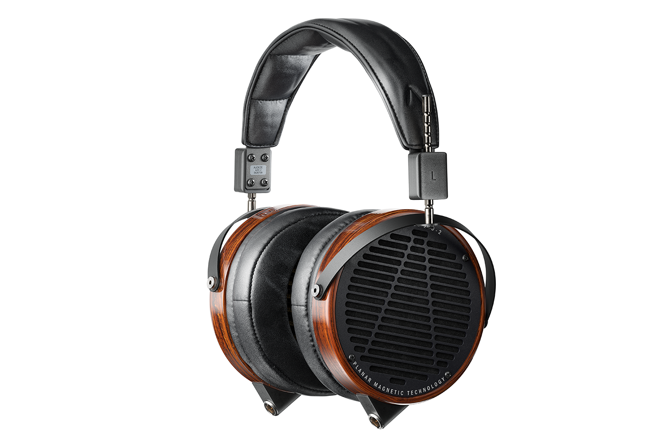
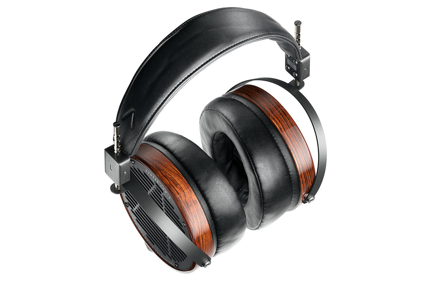
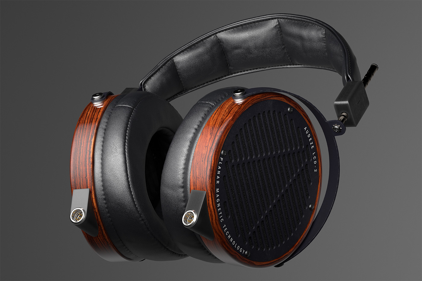
This is the first shot, a close-up.
The angle allows both cups to stay in the frame without distorting the headband. The main light comes from the front, with additional lights aimed at the metal mount rods on each side. Another light from the back highlights the side of the cup and the leather pad.
The angle allows both cups to stay in the frame without distorting the headband. The main light comes from the front, with additional lights aimed at the metal mount rods on each side. Another light from the back highlights the side of the cup and the leather pad.
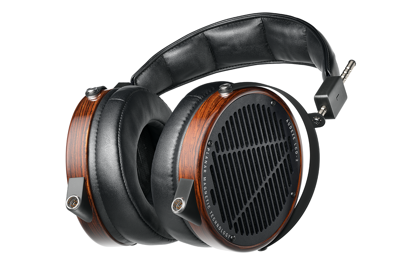
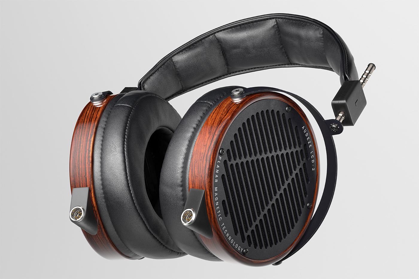
This is the main angle.
I used it as the base during the look development for these headphones. The 200 mm lens provides a very stable perspective. The main light comes from left to right, and the central specular highlight on the left side of the wooden cups is the reflection of the primary light source.
I used it as the base during the look development for these headphones. The 200 mm lens provides a very stable perspective. The main light comes from left to right, and the central specular highlight on the left side of the wooden cups is the reflection of the primary light source.
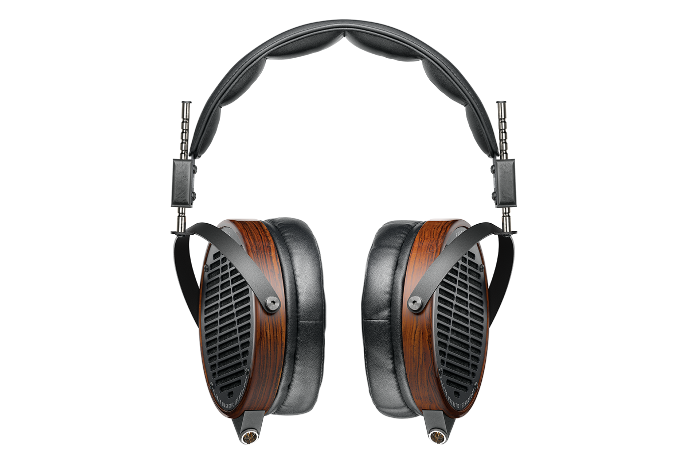
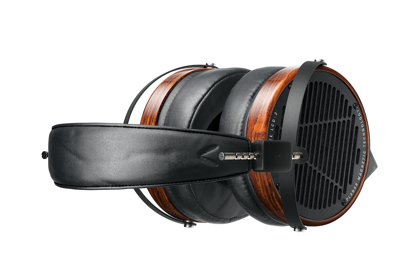
This is the frontal view.
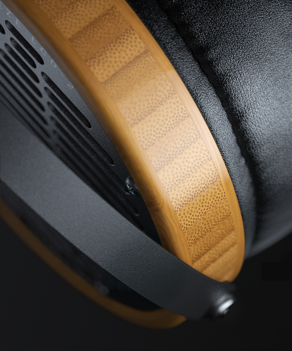
I like the anisotropy on the metal nuts in the center of the wooden cups. It was achieved using real geometric circular grooves combined with a subtle anisotropy texture.
The main challenge was to avoid excessive bloom, as the headphones have a thin silhouette and too much backlight could “eat” parts of the image.
The metal rods were lit separately with two additional lights and black reflectors to achieve a crisp, chrome look.
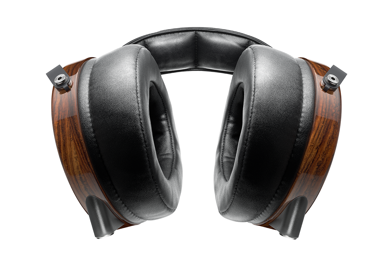
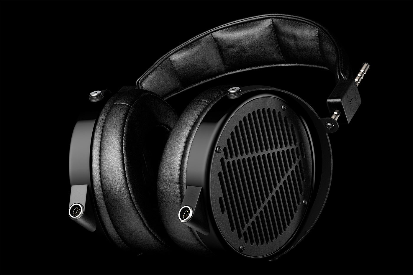
This is one of my favorites.
The main light is positioned above and in front. It was important to separate the black leather parts in the front and back, so I made the front leather pads slightly brighter to create that separation.
The main light is positioned above and in front. It was important to separate the black leather parts in the front and back, so I made the front leather pads slightly brighter to create that separation.
This is one I really like.
It has an inner perspective and a natural-looking angle. I also wanted to highlight some of the internal details, so I added light to the inner mesh fabric and the speaker.
It has an inner perspective and a natural-looking angle. I also wanted to highlight some of the internal details, so I added light to the inner mesh fabric and the speaker.
This shot is aimed at adding more volume and perspective.
I used a 200 mm lens to minimize distortion. The main light comes from the top right, helping the object stand out while preventing the background from becoming too bright.
I used a 200 mm lens to minimize distortion. The main light comes from the top right, helping the object stand out while preventing the background from becoming too bright.
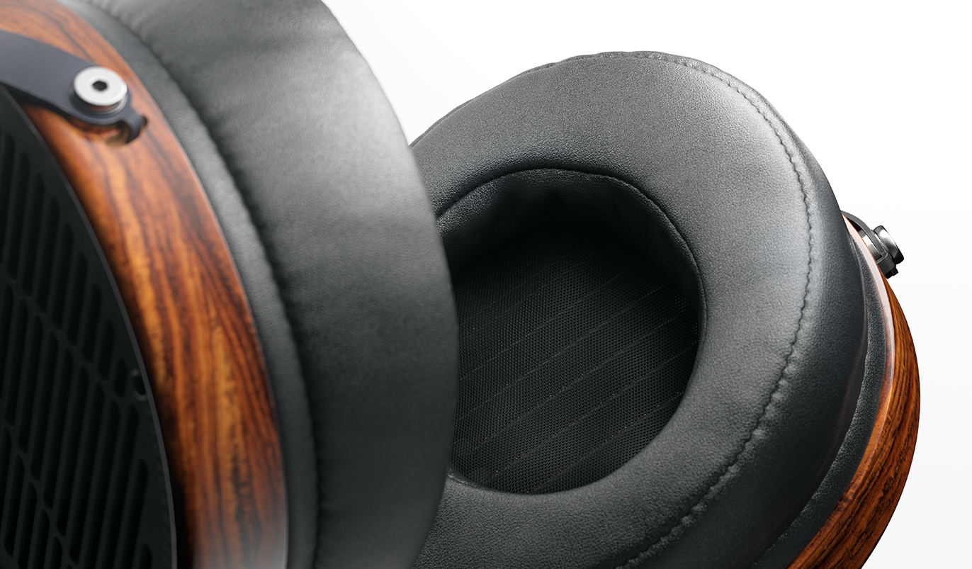
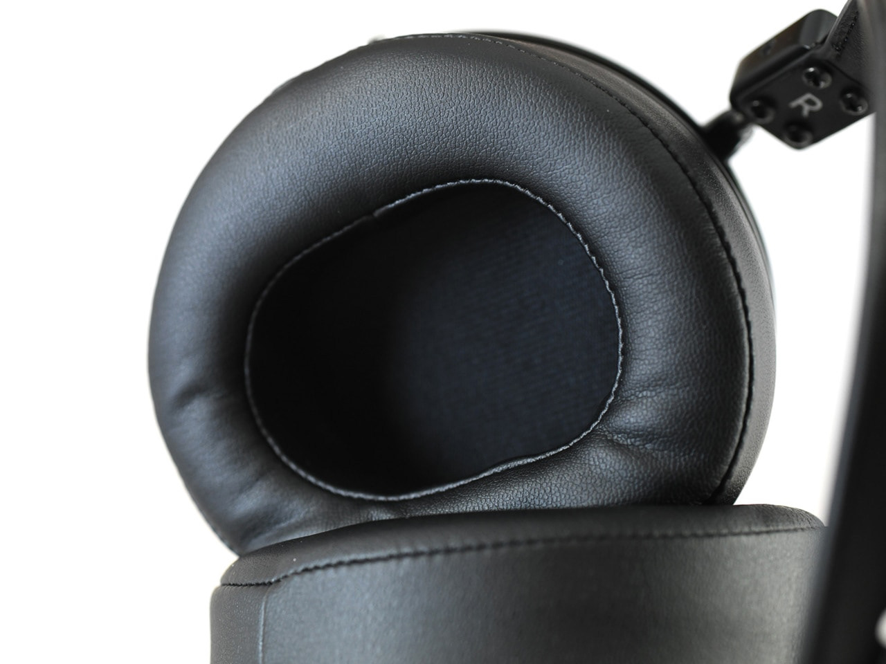
This close-up reveals hidden details. The mesh cloth and the speakers beneath it add a nice sense of depth to the image.
There are two main lights that set the mood in this image.
One is positioned at the top side to brighten the wooden cups and leather pads. The second is aimed only at the headband to give it some separation. Additional supporting lights create a smooth gradient on the black side surface of the cup and add chrome reflections to the metal rods.

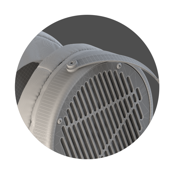
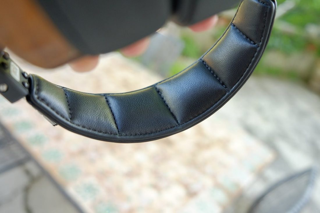
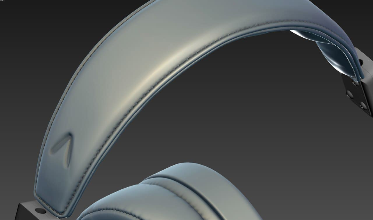
The last shot is a cropped view of the headband to show its design.
The main light source is on the right, illuminating the headband. Another focal point is the metal rod, which adds detail and visual interest. I also used a subtle curvature map to make the rough plastic slightly shinier along the edges, such as around the “L” mark. In my opinion, this gives the image a more natural look.
The Process
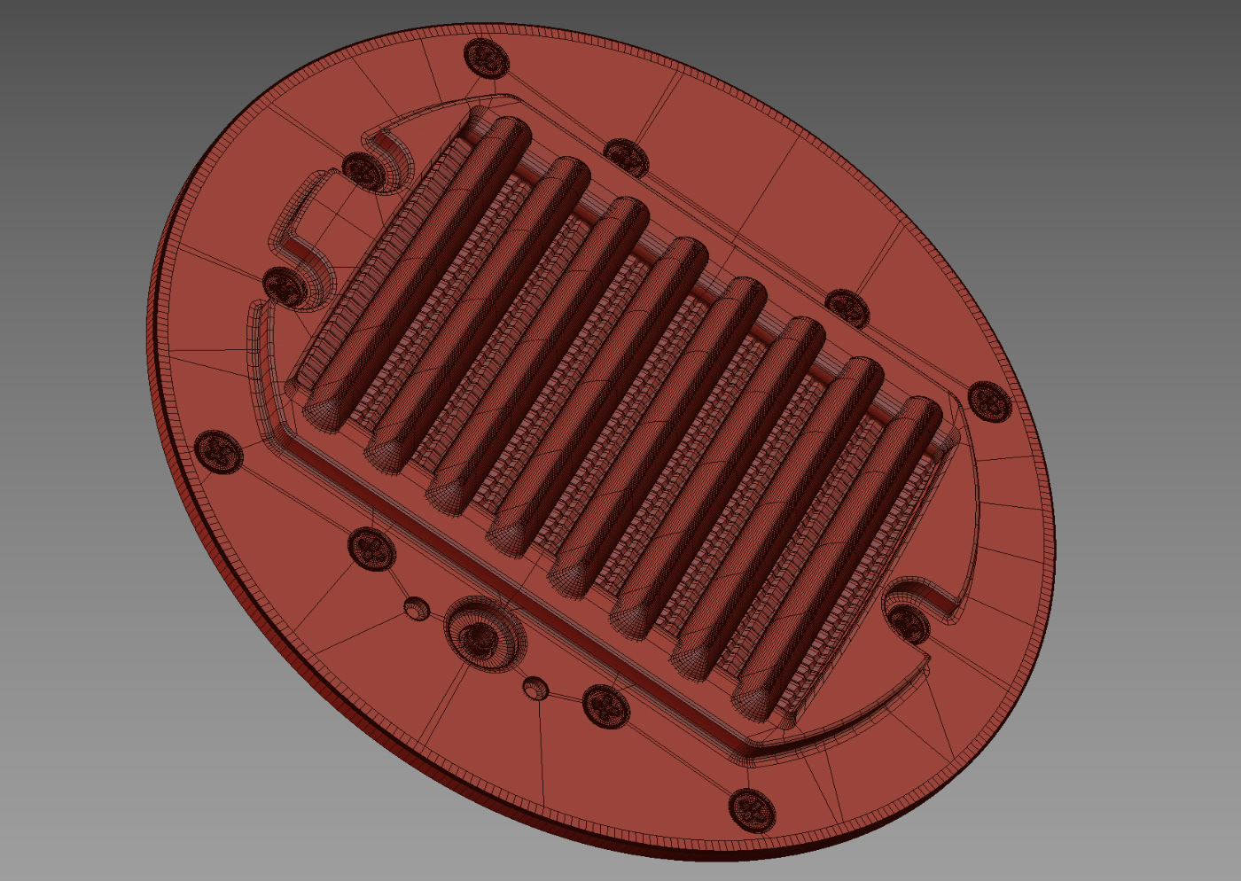
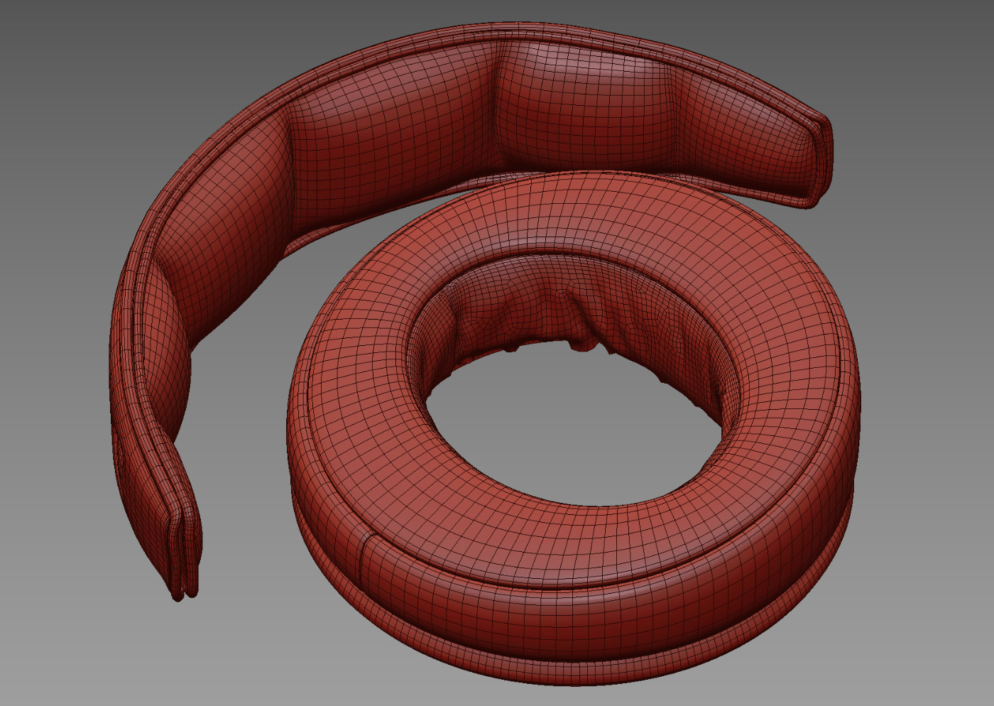
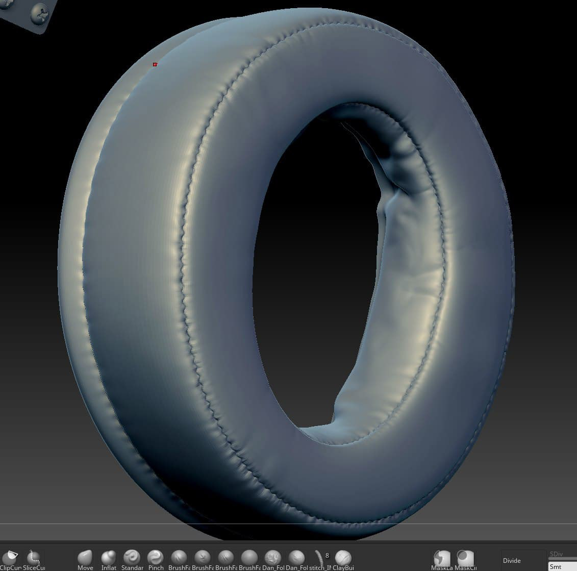
3D Model
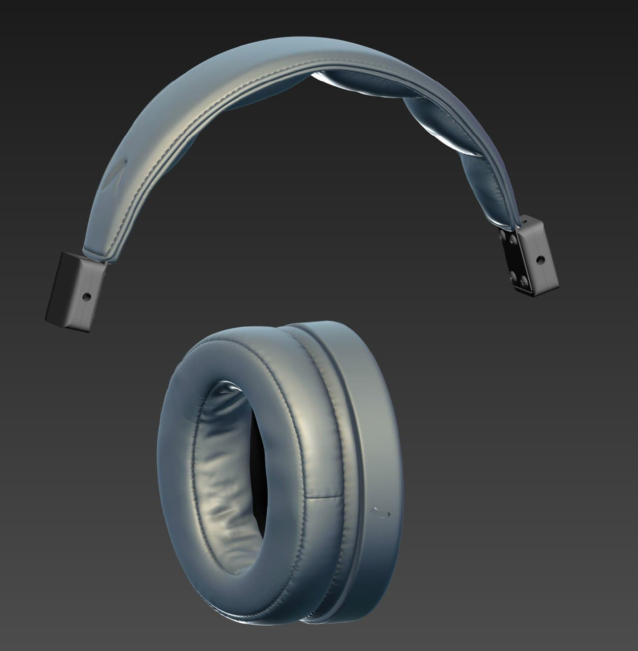
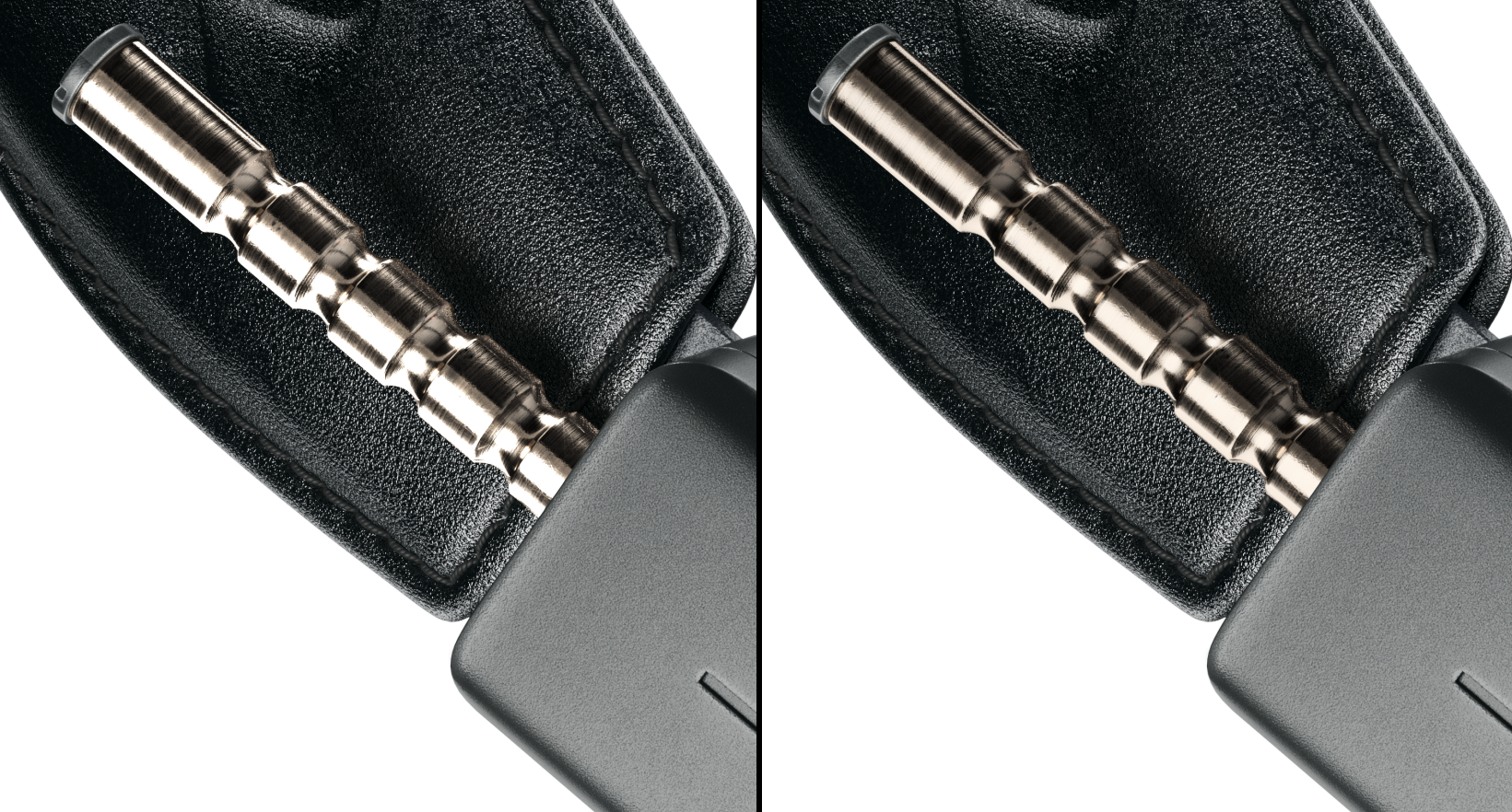
I decided to improve some parts of the model myself due to their poor quality in the original version — including the leather earpads, headband, internal sound emitter, bolts and nuts, and mini XLR connectors. These components were re-created in 3ds Max, with the leather elements further refined in ZBrush. The entire model was UV unwrapped in RizomUV.
Photo References
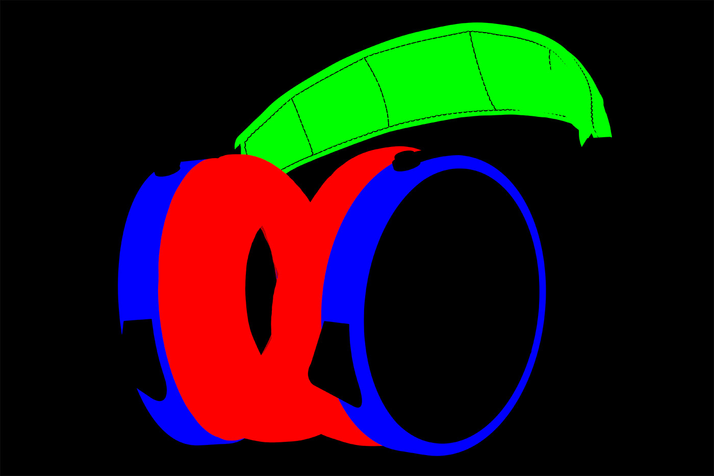
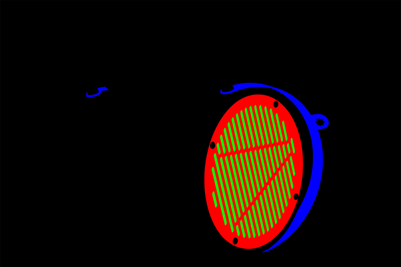
Modeling Stages
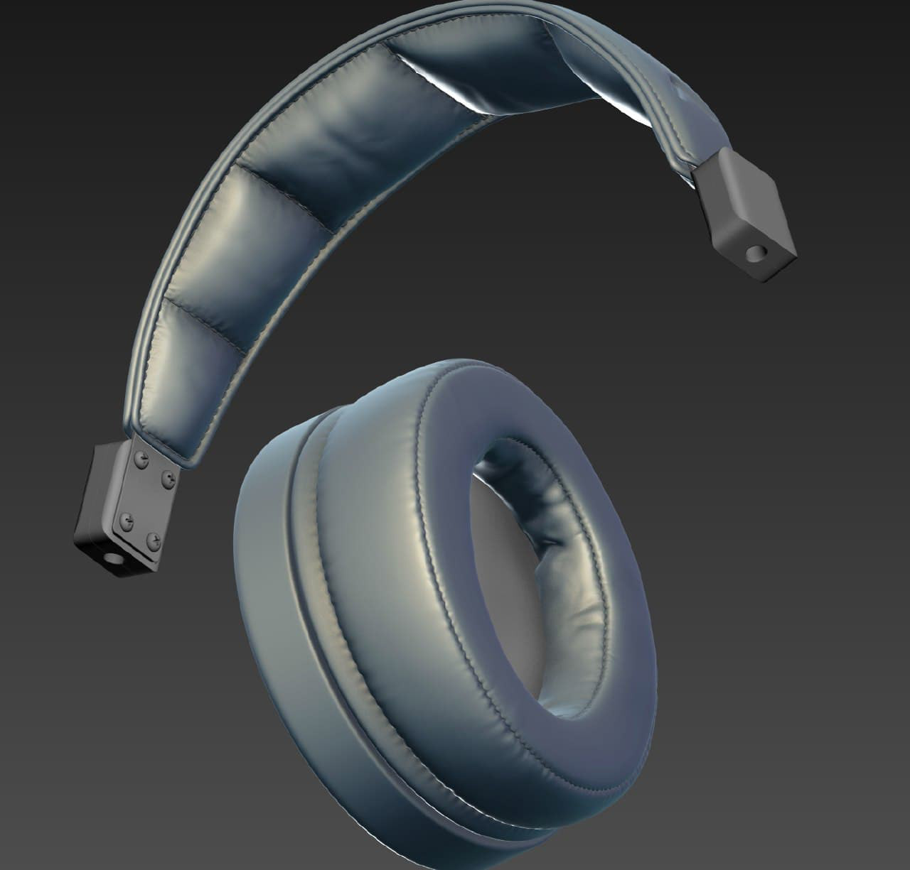
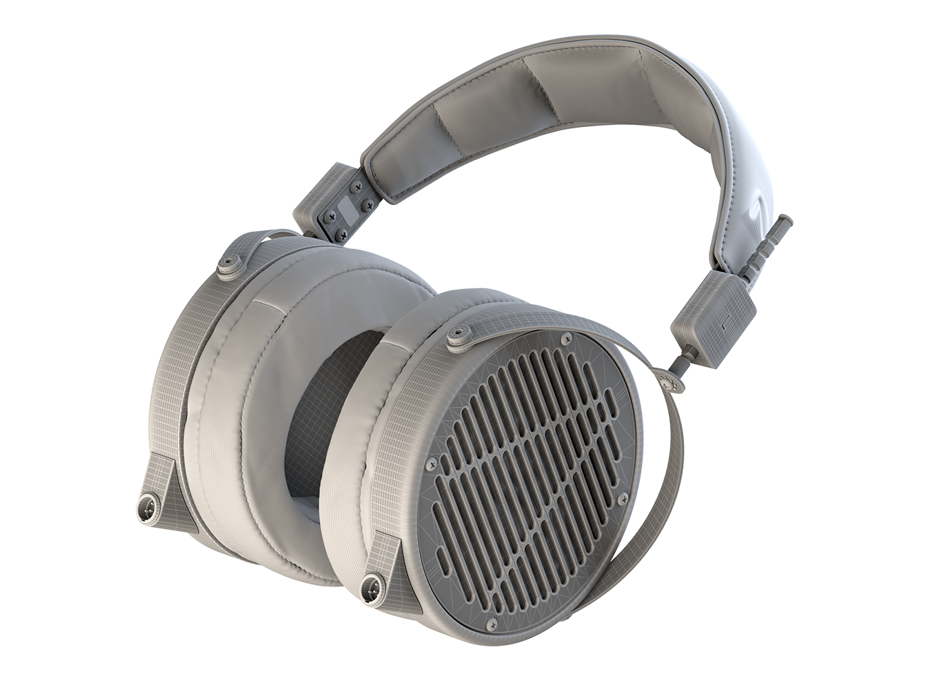
The Final Polygonal Model
Shading
When working on the shading of a headphones model like the Audeze LCD-2, the main goal is to find the right balance between the gloss of the polished wooden cups and the matte finish of the leather earpads and headband. This contrast, in my view, is what creates the classic high-end look — where warm, polished wood and soft matte leather, combined with steel and chrome details, form the aesthetic valued by true fans of this segment of audio equipment.
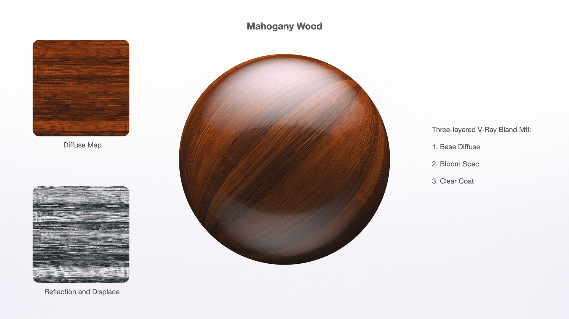
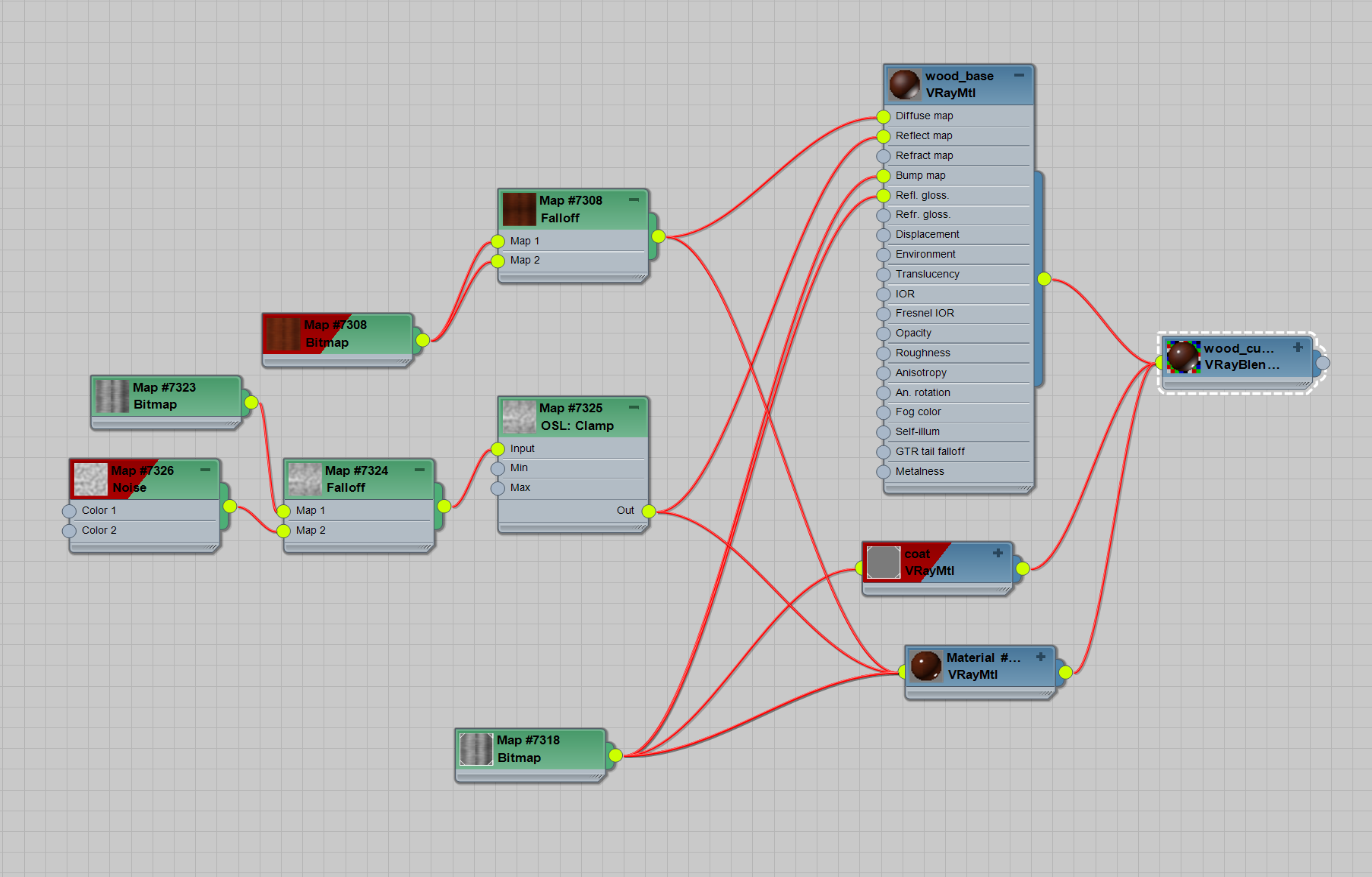
This is the main Mahogany Wood Shader I created using three layers in a V-Ray Blend material.
The first layer is a diffuse material with very low reflection.
The second adds a subtle bloom and bump.
The final layer is a clear coat, controlled with a Falloff texture.
For the main diffuse map, I blended procedurally generated wood with a real texture from the Arroway Wood collection.
The first layer is a diffuse material with very low reflection.
The second adds a subtle bloom and bump.
The final layer is a clear coat, controlled with a Falloff texture.
For the main diffuse map, I blended procedurally generated wood with a real texture from the Arroway Wood collection.
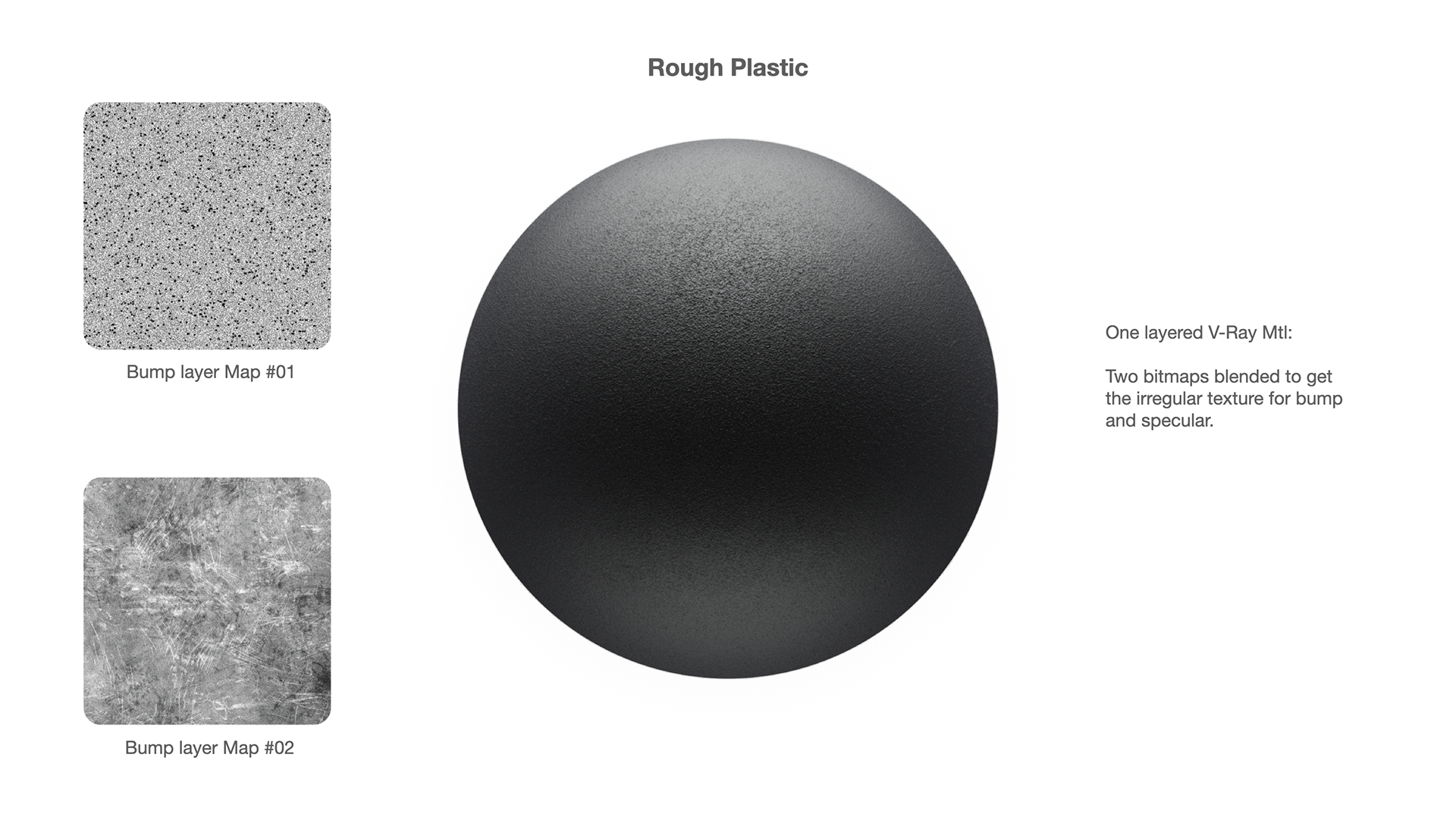
This is the Rough Plastic shader, that I used on the side part of ear-cups.
The shader is a simple one-layer material.
I used two bitmap textures to get some kind of irregular texture for bump and specular slots.

This is the Rough Black Metal, that I used for the ear cups mounts. The shader has Two Layers.
The first one is the black bumpy metal and the second is very tiny bright metal texture, controlled with the curvature map.
It allowed me to get the shiny tiny edge when I need to achieve more metal-like feeling on the details.
I love to use the procedural noise as a base and multiply it with a bitmap texture then.
That approach gives me the control for the bump size, but the result looks more natural and less procedural.
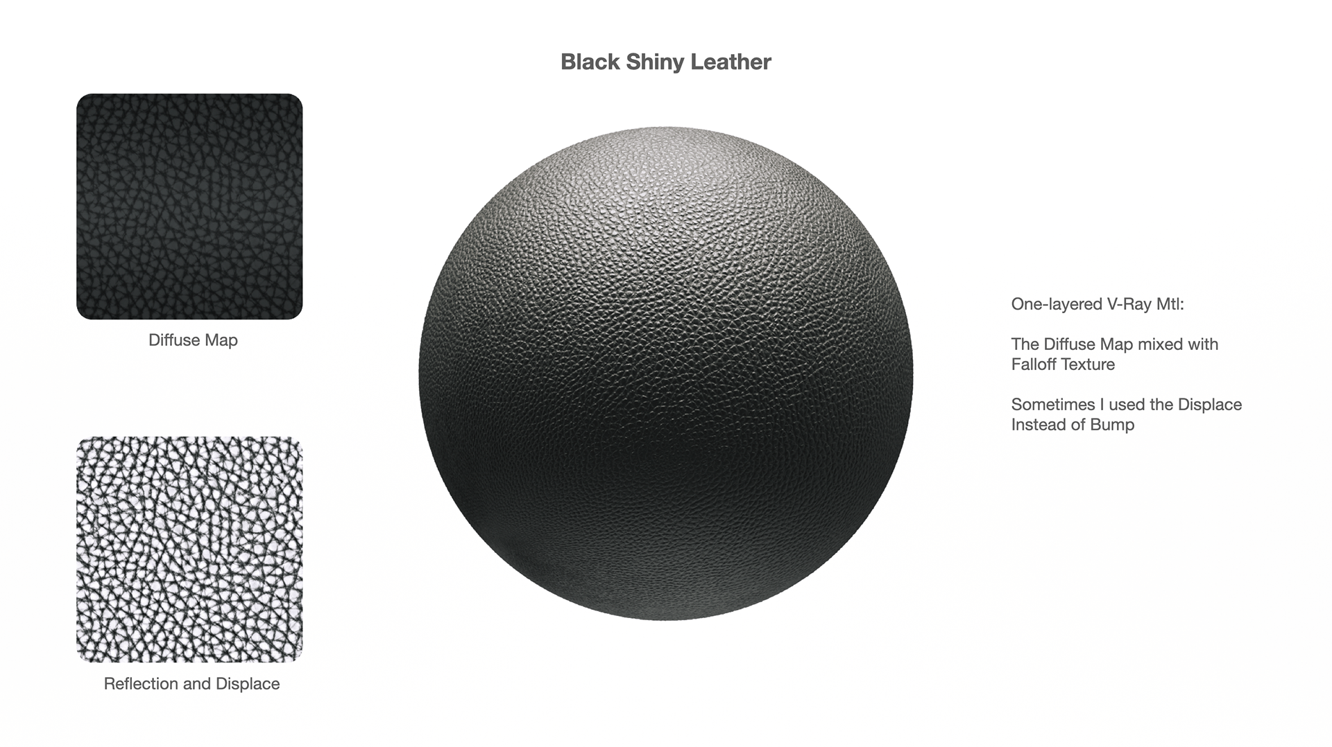
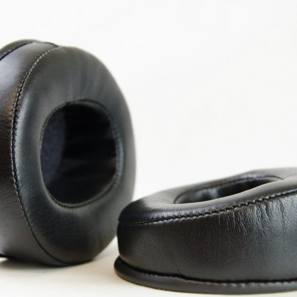
This is the main Leather shader.
Really simple, made with bitmap, Multiplied with Falloff texture.
I controlled the specular amount and look with the balance between the shader glossiness amount and power of the bump/displace.
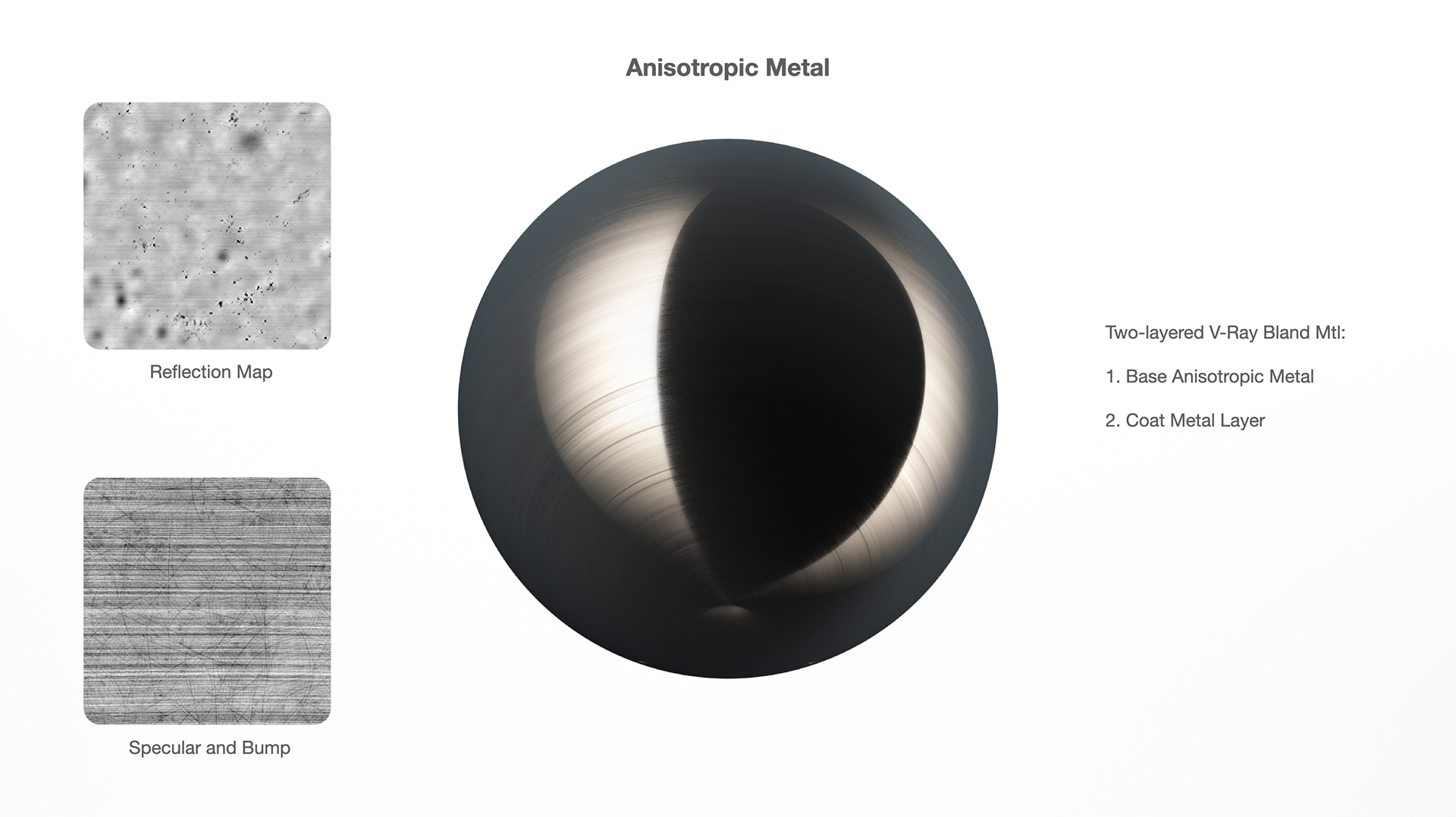
This is the anisotropic metal shader I used for the rod mounts.
Chrome-like metals are always a challenge for me, especially when rendering in a clean white environment. I need full control over the shader to achieve the right result — sometimes it needs to be highly reflective, while other times it requires more diffuse qualities and anisotropy.
Here, I used a two-layer metal shader, mixed with a Falloff map multiplied by ambient occlusion.
This approach gives the metal a more diffuse look in areas where the rods contact other parts, while still allowing me to add a stronger “chrome” effect when needed. Each rod in the scene was lit with one or two lights and a black reflector.

At the beginning of the work, I was faced with a choice of what material to use for the wooden cups. The fact is that this headphone model had several options, including Zebrano wood, Bamboo, or Mahogany.
I started with Bamboo one, as it promised to look cool with macro and closeups, however during the working process, I realized that the correct reproduction of this material, in terms of topology and how it was made in reality, would take too long and I would risk missing the deadline. However, I was able to do some tests with the Zebrano and Bamboo cups.


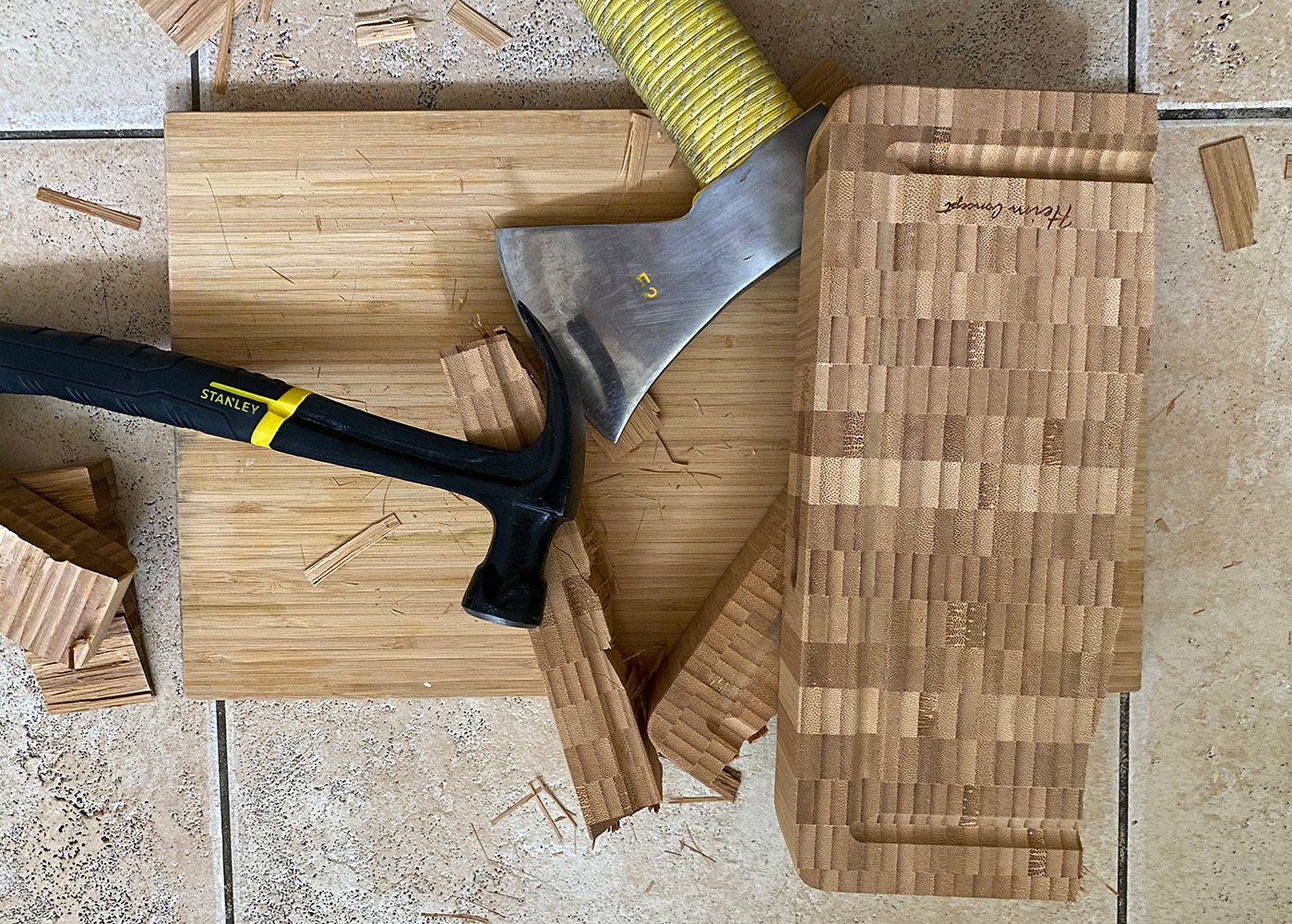
After making a several tests with Mahogany wood, I realized that in some cases with this material combination, the headphones look even better. For instance, with the wide angles, when you do not have the opportunity to evaluate the texture of Bamboo, because of its beauty low-contrast texture.
Also, when I was creating the leather and matte plastic shaders, I used a strong bump method instead of the glossiness map. In my opinion, this works a bit better and the specular lighting turns out to be more realistic than using only glossiness/roughness maps. However, it takes more time to render due to the need to increase the AA sampling.

Lighting
Having some experience in studio rendering, I always start by defining the potential “visual language” for the upcoming project before working on the lighting. This approach helps create a series of images that share a consistent style, rather than just a collection of loosely related shots.
I believe it’s important to remember that the goal is not simply to produce a beautiful image, but to present the object and the product in the right way. It’s about telling the story of the product — not the story of the images or the rendering process.
I researched the style Apple uses in their public imagery and tried to identify the principles that could guide me in this test project. The following principles and ideas shaped my approach:
Unidirectional lighting
From my observations, Apple’s renders almost always feature a primary light source that defines the overall lighting direction.
This main light is never just a neutral, soft fill — instead, it’s a strong, directional source, supported by several additional lights that help emphasize the shape.
From my observations, Apple’s renders almost always feature a primary light source that defines the overall lighting direction.
This main light is never just a neutral, soft fill — instead, it’s a strong, directional source, supported by several additional lights that help emphasize the shape.
Working with a clear white background
I noticed that in Apple’s images, objects are always clearly separated from the background and maintain strong contrast even with backlighting. Bloom and rim lighting are rarely used to blend the object into the background — and when they are, it’s applied very subtly.
I noticed that in Apple’s images, objects are always clearly separated from the background and maintain strong contrast even with backlighting. Bloom and rim lighting are rarely used to blend the object into the background — and when they are, it’s applied very subtly.
I believe the key is finding the right balance between contrast and background integration. The image shouldn’t look cut out, but excessive bloom or rim lighting can make it appear overly artificial.
Graphical / Realistic balance
In my view, Apple’s images strike a perfect balance between graphic clarity and realism.
In my view, Apple’s images strike a perfect balance between graphic clarity and realism.
With experience as a CG artist across different industries — including film, broadcast design, architectural projects, and commercials — I’ve learned that hyperrealism should never be the sole goal. There’s a point where an image starts to look unrealistic, but there’s also the opposite problem: achieving “realism” through shortcuts like fingerprints, texture flaws, signs of wear, dust, chromatic aberrations, or exaggerated depth of field.
When such shortcuts aren’t an option, more attention must be given to shading. Textures need to be of a high enough quality that the viewer never feels the result looks simplified. Striking the right balance between clean reflections and detailed textures became one of the main goals of this project.
Gradient ramps instead of HDRi
I couldn’t find any Apple images where it was clear that HDRi was used as a texture for the light source. I assume this is because the imperfections of a real light source — for example, a fold in a softbox diffuser — could create a misleading impression on the surface. In reflections, such a fold might appear like an edge, which could distort the viewer’s perception.
I couldn’t find any Apple images where it was clear that HDRi was used as a texture for the light source. I assume this is because the imperfections of a real light source — for example, a fold in a softbox diffuser — could create a misleading impression on the surface. In reflections, such a fold might appear like an edge, which could distort the viewer’s perception.
For this reason, I decided not to use HDRi for image-based lighting or as a texture for light sources. Instead, I used gradient ramps. This approach provides cleaner, more uniform lighting and better control over how reflections fade, depending on the camera angle.
Non-randomness of lighting
Another feature I notice in the way Apple presents its images is the absence of random, unwanted reflections and highlights — something that’s often hard to avoid when simulating natural lighting.
Another feature I notice in the way Apple presents its images is the absence of random, unwanted reflections and highlights — something that’s often hard to avoid when simulating natural lighting.
The lights in these images seem to be arranged as part of a unique lighting setup designed specifically for each shot, rather than a universal softbox rig simply rotated around the object. Each set of light sources is clearly tailored to the particular image and camera angle.
Stable camera angles
The geometric shapes of the chosen headphones model, combined with the lack of curved and glossy surfaces, make it impossible to rely on just a few light sources. Instead, the main object must be “drawn” with light, which makes selecting the primary lighting direction especially important.
The geometric shapes of the chosen headphones model, combined with the lack of curved and glossy surfaces, make it impossible to rely on just a few light sources. Instead, the main object must be “drawn” with light, which makes selecting the primary lighting direction especially important.
Camera angles also play a key role. I needed to keep the silhouette of the object easily recognizable without using overly dramatic or unconventional angles.
Rendering

I used a real-geometry studio as the base environment.
It was built from two L-shaped backgrounds — white on the bottom and sides, and black on the top and front — similar to a standard photo box, but larger in scale.
It was built from two L-shaped backgrounds — white on the bottom and sides, and black on the top and front — similar to a standard photo box, but larger in scale.
I also added a smaller L-shaped background and several black, specular-blocking screens to work with the chrome details and to control reflections on the wooden cups.

I used a rectangular V-Ray Area Light as my main “painting” light, applying a gradient texture to it.
Once the main lighting direction was set, I added additional Area Lights to create backlighting and to produce reflections on the chrome surfaces.
Once the main lighting direction was set, I added additional Area Lights to create backlighting and to produce reflections on the chrome surfaces.
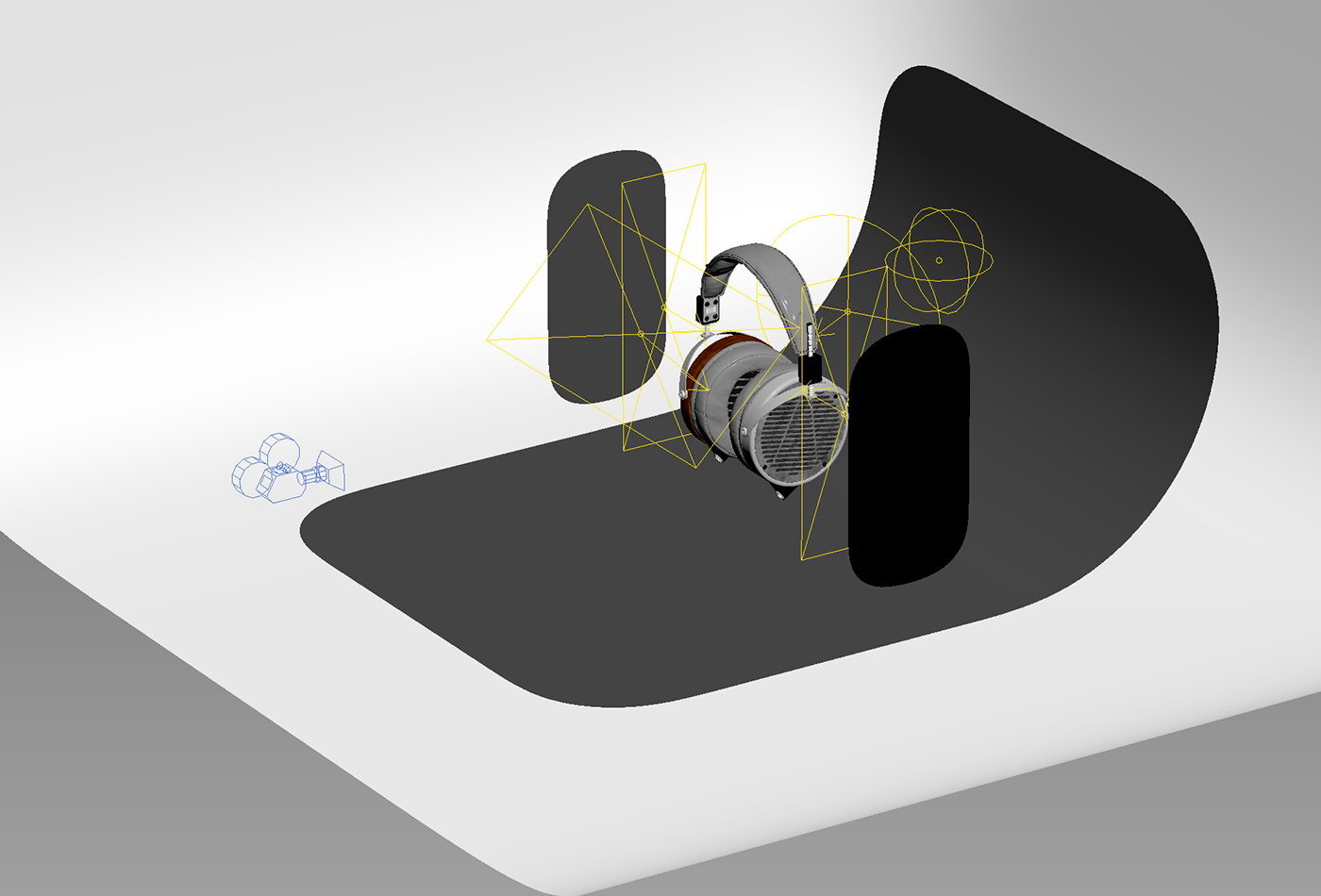
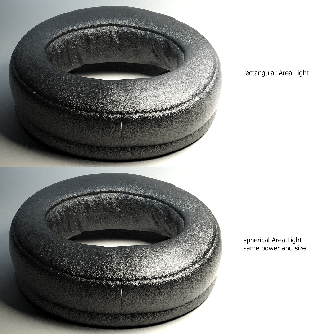
Since reflections on the leather material can appear too flat with planar Area Lights — due to the sampling area (V-Ray samples a rectangular Area Light as a rectangle on the object’s surface) — I used V-Ray Sphere Lights for the leather shader.
This allowed me to achieve soft, smoothly fading specular highlights.
This allowed me to achieve soft, smoothly fading specular highlights.
I only used the include/exclude lighting method in a few cases, such as when working on reflections for the chrome and metal surfaces.
Despite the many light sources in the scene, the setup still forms a cohesive lighting scheme. The number of lights is mainly due to the need to define the object’s silhouette and to compensate for the lack of GI on the dark, matte leather surfaces.
Despite the many light sources in the scene, the setup still forms a cohesive lighting scheme. The number of lights is mainly due to the need to define the object’s silhouette and to compensate for the lack of GI on the dark, matte leather surfaces.
Postwork
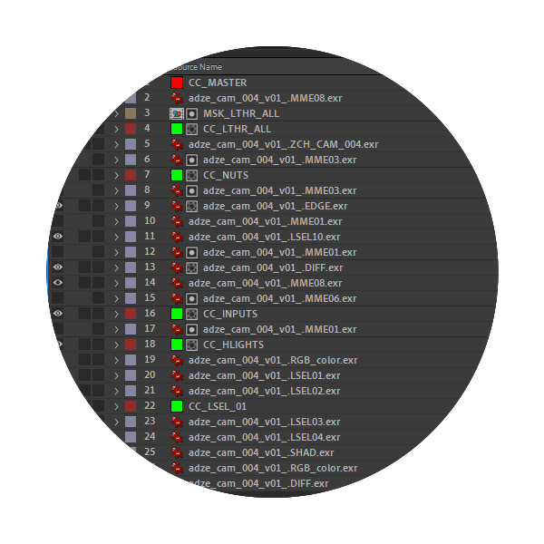
All images were rendered with GI using the Light Cache + Bruteforce scheme. The list of standard passes for work includes:
Diffuse color / Reflections / Specular Lighting / Shadows / Raw Total Light / GI / Ambient Occlusion / Edges Curvature / Multimatte Elements / Light Selects / Z-Channel / Falloff


With more than 15 years of experience in commercial CG graphics, I have developed a personal pipeline that helps streamline the process of achieving the final result.
The render from V-Ray should be saved in 32-bit EXR format, which makes it possible to correct overexposed metal areas without losing the material’s texture.
The render from V-Ray should be saved in 32-bit EXR format, which makes it possible to correct overexposed metal areas without losing the material’s texture.
My choice of After Effects comes from the fact that it works like Photoshop for video.
If I need to move on to animation, all adjustment layers can be easily applied to the animated sequences.
If I need to move on to animation, all adjustment layers can be easily applied to the animated sequences.
There’s also another advantage to this approach. During the look development stage, I can work with low-resolution renders — for example, 2K instead of 6K. Once the overall look is finalized, I simply replace the low-res 2K renders with the high-res 6K versions, keeping all effects and post-processing intact.
The final step is processing in Photoshop, where I apply nuanced color adjustments using Selective Color and Curves.
Given the stylistic restrictions on using depth of field, I also applied an ultra-sharpness technique — selectively sharpening a specific area of the image by 10–12% while leaving the rest unchanged. This subtle effect is often enough to give the viewer the impression of a slight depth of field transition.

Thank You